Pickle
Leading end-to-end specialist communications provider offering smarter, safer, IT and connectivity solutions.
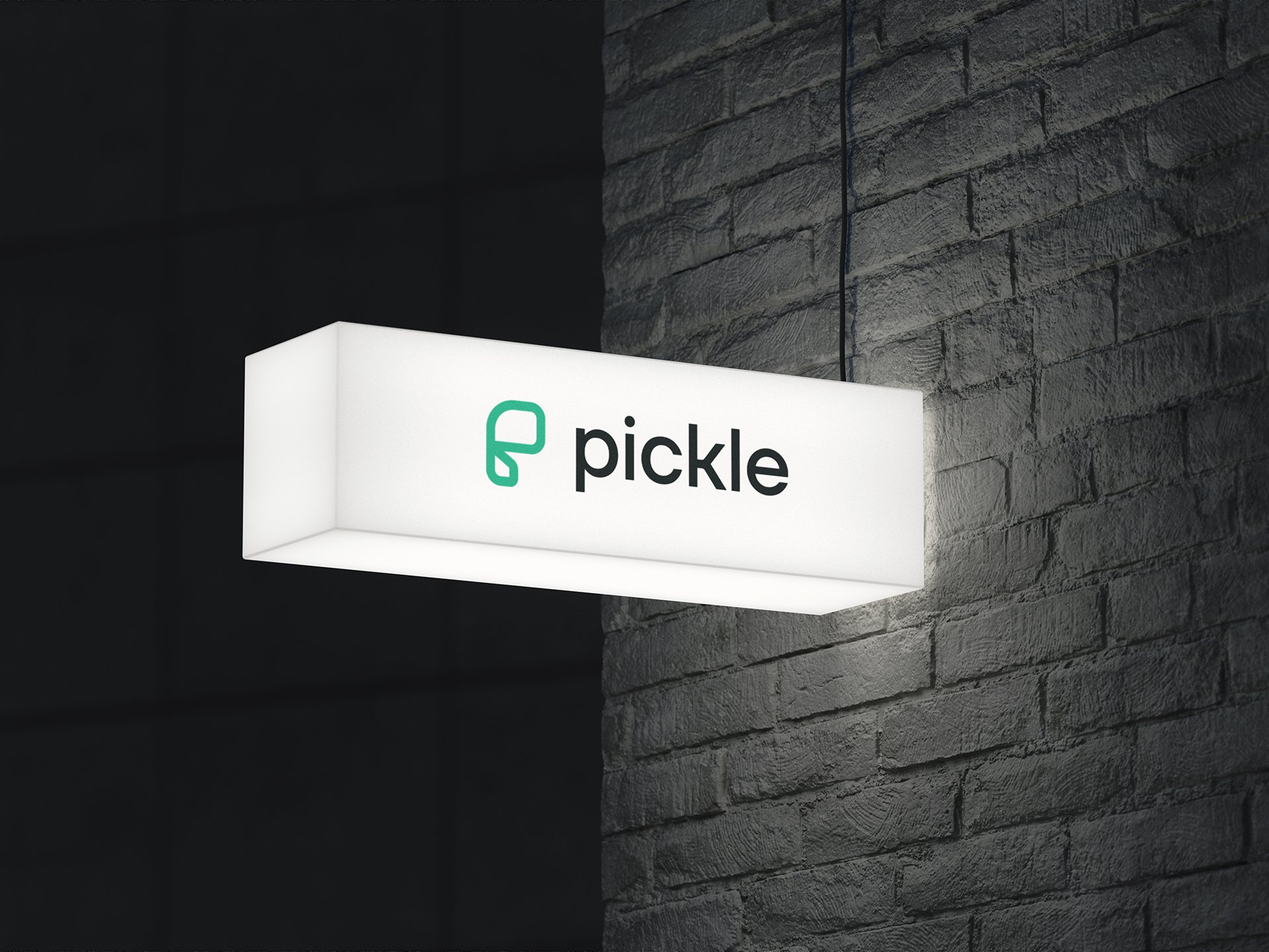
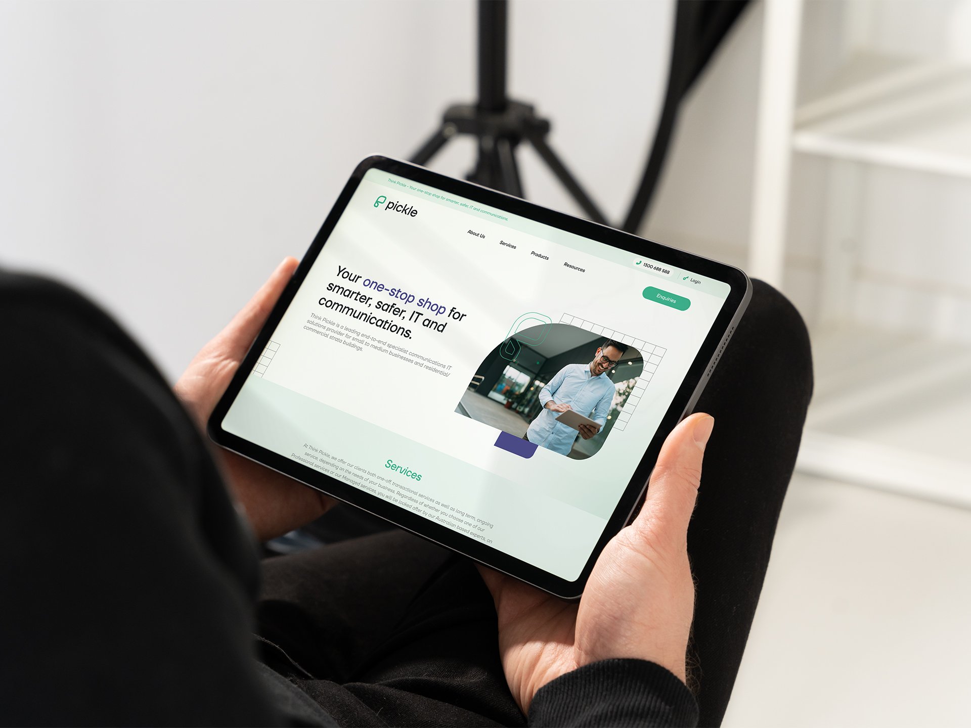
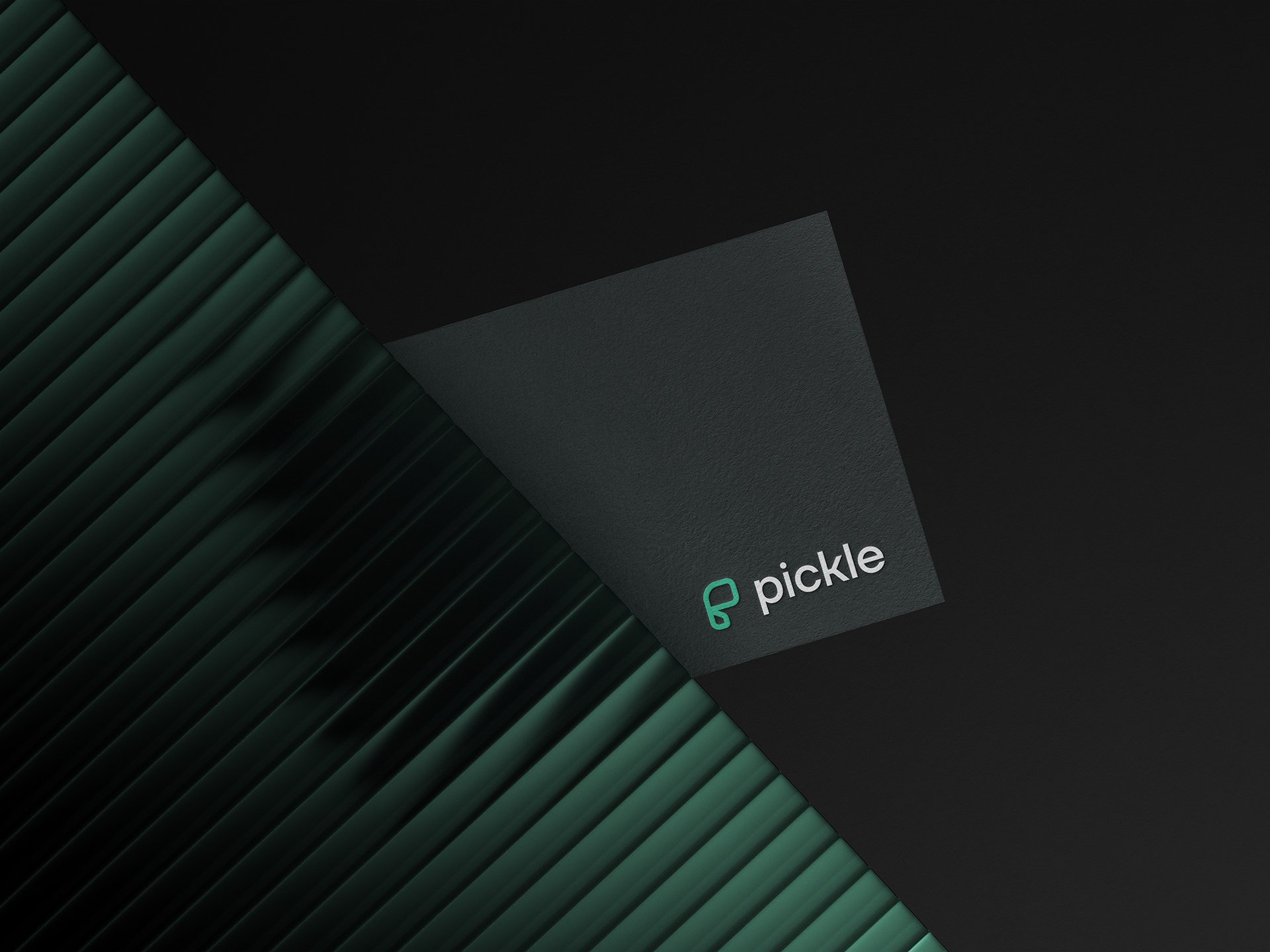
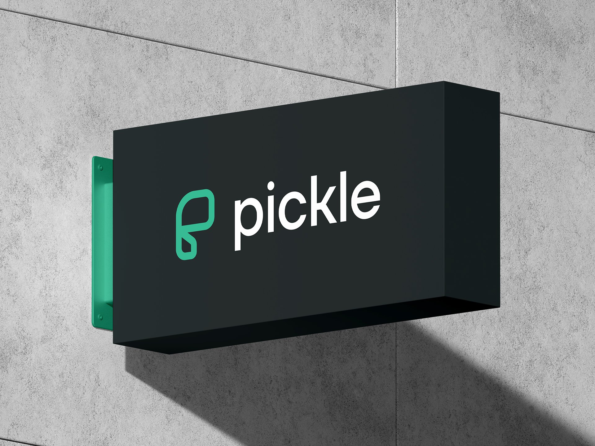
Pickle's rebrand embraces modern simplicity, transforming its visual identity with clean lines and a minimalist colour palette. This fresh approach positions Pickle as a contemporary, user-friendly brand while maintaining its core values of quality and innovation.
This logo concept embodies the evolution of communications by seamlessly integrating a stylised “P” that’s shape also reflects both an analog phone and a new-age wireless earphone, symbolising the transition from past to present technologies.


The modern elevation of the Pickle colour palette, coupled with a minimalist sleek aesthetic and impactful typography, reflects the brand’s commitment to intuitive innovation with a sophisticated and restrained design approach.


The upstairs bar presented an opportunity to elevate the branding, and we achieved this by creating a refined interpretation of the iconic Brick Lane sign. By weaving in its familiar elements with a sophisticated touch, we reinforced the brand’s identity while adding a sense of exclusivity.
We selected a premium typeface and paired it with a deep navy blue palette, which helps create an atmosphere of understated luxury that seamlessly aligns with the upscale ambiance of the interior design.